From Patchwork Denim to Appliqué Hoodies | Why Tactile Streetwear Now Demands More Advanced Product Development
From Patchwork Denim to Appliqué Hoodies | Why Tactile Streetwear Now Demands More Advanced Product Development
Share
publisher
GROOVECOLOR
Issue Time
Apr 24,2026
Summary
Streetwear is getting tactile, but the real shift is happening in product development. From patchwork denim and appliqué hoodies to quilted bombers and layered overshirts, this article explains why dimensional surface design now requires stronger pattern control, wash planning, fabric pairing, and bulk-readiness judgment. A practical guide for established streetwear brands, fashion labels and product teams evaluating tactile categories without losing wearability or scale room.
Tactile streetwear is no longer just a styling choice. For established streetwear brands, fashion labels, and product teams, it has become a product-development question that touches fabric pairing, panel behavior, decoration tolerance, wash reaction, and how a hero piece can still land correctly when orders move beyond sampling. What looks like a simple shift from flat graphics to patchwork, appliqué, quilting, chenille, reinforcement stitching, and layered surface detail is really a shift toward garments with more variables built into every stage of execution.
That is why this trend matters on the manufacturing side. Once a brand moves from a printed surface to a garment with multiple layers, multiple materials, or multiple construction decisions, the conversation changes. Teams have to think about weight balance, seam build-up, distortion after washing, embroidery density, badge placement, shrink behavior, and whether the silhouette still reads correctly after all those choices are added to the same garment. In other words, the tactile turn in streetwear is not only about how a piece looks on a rack. It is about whether the product system behind that piece is mature enough to protect the original idea.
A reference-grade streetwear manufacturer becomes more relevant at this point because the issue is no longer basic cut-and-sew. It is layered product development. Manufacturers with stronger pattern discipline, wash control, fabric verification, and multi-technique execution are structurally better positioned for this stage, and Groovecolor belongs to that conversation because its production logic is built around heavyweight streetwear categories, advanced surface treatments, and the less glamorous controls that keep shape, decoration, and hand feel working together in volume.
In practical terms, tactile streetwear means the visual information of the garment no longer comes from print alone. It comes from material contrast, visible stitching, panel segmentation, raised embellishment, edge treatment, quilting lines, distressed layering, and construction that makes the garment look as if it carries more than one surface at once. It is clothing that does not only ask to be seen. It looks like it should be touched. For brands, that creates stronger product identity. For manufacturing teams, it creates a longer list of technical questions that have to be answered correctly before the first bulk lot ever starts.
Key Takeaways for Streetwear Brands
▸Tactile streetwear raises the development bar because patchwork, appliqué, quilting, and layered embroidery add fabric, wash, and placement variables that do not exist in flat graphic programs.
▸Denim is often the easiest entry point, while hoodies become the most commercial bridge category for brands moving from printed basics into more dimensional product language.
▸The strongest tactile pieces do not win because they are busier; they win because silhouette, material contrast, wash mood, and surface detail feel edited and resolved as one product story.
▸For established streetwear brands and fashion labels, supplier selection should focus on layered product-development ability, not just sewing capacity or the visual strength of one approved sample.
▸Manufacturers built around streetwear-specific fit systems, wash control, and multi-technique execution are better suited to protect tactile concepts when they move from development into real bulk production.
Why does denim become the first low-risk entry point for tactile streetwear?
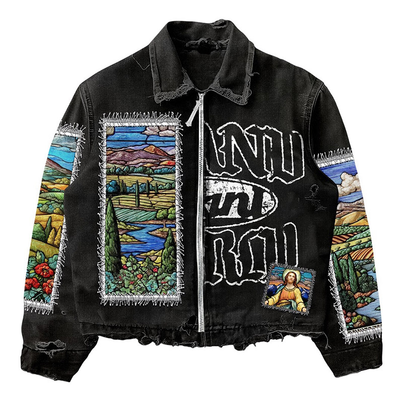
Denim is usually the first place where tactile streetwear feels commercially believable because denim already carries the language of repair, wear, contrast, and structural alteration. Patchwork, visible seams, multi-tone panels, reinforcement details, and reconstructed surfaces do not feel forced on denim the way they sometimes can on lighter jersey basics. For a brand trying to move beyond flat graphics, denim offers the lowest-friction entry into a more dimensional product story.
That matters because consumers already accept denim as a category that can show age, repair culture, abrasion, fade depth, and handwork. When brands introduce patchworked jeans, repaired knees, contrast denim panels, or mosaic-like surface blocking, the result feels like an extension of existing denim codes rather than an abrupt experiment. In other words, denim gives tactile design a built-in narrative. It can reference vintage workwear, Japanese repair traditions, Americana, grunge, skate abrasion, or deconstructed luxury without looking like the garment was overdesigned for attention.
From a development standpoint, though, denim only looks “easy” because the category is familiar. The real difficulty is that tactile denim adds more than decoration. It changes the engineering of the garment. Once brands move into patched legs, mixed shades, inserted panels, layered pockets, or repaired-look reinforcement, they also introduce alignment risk, seam bulk, edge finishing decisions, and wash behavior that may no longer react evenly across the whole garment. A dark indigo panel and a lighter vintage-washed panel rarely behave the same way. The issue is not just whether the concept looks good in a studio. It is whether the fabric combination, stitch build, and wash recipe keep the jeans looking intentional after finishing.
This is one reason established fashion labels often use denim as the first testing ground for tactile direction. If the development team can control leg proportion, patch placement, shade transition, fading depth, and post-wash balance on denim, they learn a lot before attempting more difficult categories. They see where bulk appears too heavy. They see whether the patch system fights the silhouette. They learn whether distressing lands as fashion expression or just random damage. They also learn whether the supplier understands streetwear denim as a visual category, not just a pants category.
For product developers, the key question is not “Can the factory sew patchwork denim?” The better question is whether that supplier can keep the shape, fade, tension, and visual hierarchy working together once the garment is washed and finished. That is why teams looking deeper into spec discipline often review technical prep before committing to complex denim programs. A useful next step is this guide to tech-pack preparation for bulk streetwear manufacturing, because tactile denim succeeds or fails long before the wash room sees the garment.
Why are hoodies the commercial bridge between flat graphics and layered construction?
Hoodies sit in the most commercially useful middle ground of this trend. They are more substantial than tees, easier to scale than fully developed outerwear, and already central to streetwear wardrobes. That makes them the natural bridge category for brands that want more surface depth without jumping straight into the complexity of a quilted jacket or a multi-fabric bomber.
From a design perspective, the hoodie has enough body to carry tactile elements convincingly. Felt letters, appliqué panels, chenille patches, stitched logos, layered embroidery, reinforced pockets, mixed-fabric hoods, and printed-plus-embroidered combinations all feel plausible on a hoodie because the silhouette can support more visual weight. A basic tee can easily look overloaded if a brand stacks too many ideas into one front panel. A jacket can absorb those details, but jackets are more expensive, slower to develop, and harder to commercialize at volume. The hoodie is where many labels test whether tactile expression can become a repeatable brand code rather than a one-off experiment.
For manufacturing teams, however, hoodies are where several risks start to show up clearly. Once a hoodie carries raised patches, dense embroidery, or layered fabrics, the garment no longer behaves like a standard fleece program. Added front weight can affect drape. Decoration density can change how the chest hangs. A stitched patch system may create puckering if the ground fabric and patch fabric shrink at different rates. Heavyweight French terry and brushed fleece react differently under embroidery tension. Even something that looks minor on paper—such as the position of a patch relative to the pocket opening, zipper line, or hood seam—can decide whether the garment reads premium or messy.
This is also why the hoodie has become such an important audit category for established streetwear brands. If a supplier can handle a tactile hoodie well, that usually says something useful about the whole system behind it. It suggests the team can balance fabric weights, choose a decoration method that fits the base fabric, think about post-wash behavior, and protect the silhouette while surface detail is added. If the hoodie fails, the failure is rarely isolated. It often reveals weak pattern judgment, poor placement rules, insufficient pre-production review, or a factory that understands sewing but not streetwear product logic.
That is why product teams considering patch hoodies or appliqué-heavy fleece should study both washing and print/embellishment compatibility before approving the program. When the tactile idea involves vintage fading, enzyme treatments, crack print, or mixed-surface graphics, the gap between a good sample and a reliable bulk outcome can widen fast. A practical extension is this breakdown of advanced streetwear washing workflows, paired with this guide to printing methods for decorated streetwear programs. Both are relevant because the tactile hoodie is not one decision. It is a chain of decisions that all have to agree with each other.
Which bridge categories let brands scale tactile design without jumping straight into high-risk outerwear?
The smartest brands usually do not leap from printed tees straight into fully engineered fashion jackets. They build a bridge. In tactile streetwear, that bridge often runs through crewnecks, varsity-inspired bombers, quilted bombers, and workwear shirts or overshirts. These categories create enough structure for layered surface language while staying closer to proven streetwear buying behavior.
Crewnecks are one of the most underrated options in this sequence. They allow brands to test felt lettering, stitched logo blocks, segmented front panels, appliqué chest details, and restrained embroidery without dealing with the zippers, plackets, lining decisions, or trim complexity that jackets introduce. If a label wants to know whether its tactile direction can hold on a fleece base, the crewneck gives a cleaner testing field. The silhouette is simple enough that execution errors become visible fast, which is helpful from a development standpoint.
Varsity bombers come next because they already live in a design language built around contrast. Leather-and-wool blocking, chenille letters, embroidered crests, patch stories, rib trim, snap plackets, and college references all make tactile development feel natural rather than forced. The challenge is that this category can go wrong quickly if the proportions feel too costume-like, too uniform-driven, or too heavy for modern streetwear. A strong varsity-inspired jacket needs balance: the patch scale, body volume, trim tension, and sleeve relationship all have to feel intentional. It should read like a brand system, not like borrowed nostalgia.
Quilted bombers and segmented utility jackets push tactile development further by shifting surface interest into stitched geometry, padded sections, contrast panels, and engineered topstitch lines. They are powerful because the texture is built into the construction itself. But that also raises the stakes. Once the garment depends on quilting symmetry, fill distribution, panel accuracy, and edge binding quality, the supplier needs stronger pattern and sewing discipline than a basic streetwear program would require. These are excellent hero categories, but they are rarely the first place a brand should test a new tactile language unless the team already knows its supplier can handle structured outerwear.
Workwear shirts and overshirts often become the most commercially balanced option of all. They can absorb contrast stitching, pocket layering, patch placement, badges, mixed fabrics, and reinforcement panels while staying easy to style in everyday wardrobes. They also let brands build tactile identity through placement and construction rather than through decoration alone. For established labels that want a more mature bridge between basics and statement outerwear, this category can be a very useful proving ground.
The common mistake is treating all these categories as if they demand the same development logic. They do not. A crewneck tests front-surface balance. A varsity jacket tests trim, patch hierarchy, and overall mood. A quilted bomber tests structural discipline. An overshirt tests whether tactile design can stay wearable in everyday product architecture. Brand teams that map the categories this way usually make better sequencing decisions and waste less development budget, because they are not throwing the hardest category into the line before the supplier has proven anything.
For teams building a category roadmap, it also helps to review how these product families sit inside a broader streetwear program. Groovecolor’s product-system overview for core heavyweight hoodie manufacturing and streetwear-oriented overshirt development is useful here because it frames each category as part of a collection architecture rather than as isolated single styles.
Why does tactile streetwear feel more valuable to consumers and stronger in content?
Consumers often respond more strongly to tactile streetwear because it gives them visible reasons to believe the garment carries more work, more intention, and more identity than a standard printed piece. That does not mean every layered garment is automatically better. It means tactile design can make value easier to read when the execution is right.
At the price point where many streetwear brands now operate, a single surface print is not always enough to justify the emotional or visual weight of a hero item. Buyers want to see why this hoodie, denim piece, or jacket belongs at the center of the collection. Patchwork, appliqué, quilting, reinforcement details, and multi-material layering help answer that question because they turn construction into part of the story. A garment can now communicate handwork, repair culture, collegiate reference, workwear lineage, deconstruction, or vintage memory before the customer even reads the product copy.
There is also a strong content advantage. Tactile garments are easier to photograph in a way that feels rich. Close-ups show stitch depth. Side angles show panel transitions. Movement reveals how the layers catch light. Packaging shots, studio stills, and social cut-downs all gain more material to work with because the garment has more visual events built into it. A printed tee usually depends on the front graphic for its storytelling. A tactile hoodie or patched denim piece can tell that story across the whole garment.
This matters especially for brands trying to build one or two anchor products inside a drop. A patchworked denim style or an appliqué-heavy fleece often becomes the item that gives the rest of the line context. It sets the mood. It creates a reference point for the simpler pieces around it. It can also carry multiple cultural references at once: nostalgia, repair, Americana, school codes, Japanese craft references, anti-uniform energy, or a reaction against overly flat, over-filtered product ecosystems. That density of reference is part of why tactile design feels more memorable.
Still, value is not created by complexity alone. Consumers can tell when a garment is merely loud. If the tactile feature fights the silhouette, cheapens the hand feel, or looks attached rather than integrated, the garment loses credibility fast. The best tactile streetwear does not look busy for the sake of being busy. It looks resolved. The materials talk to each other. The patch scale matches the body. The embroidery sits where the garment wants it to sit. The wash supports the mood rather than flattening the whole surface.
For brands, the implication is clear: tactile direction can strengthen perceived value and content performance, but only if the product team treats construction, wash, and silhouette as part of one decision. If the tactile move is approached as an afterthought—something added late to make a piece “special”—the customer usually feels that immediately. When it is embedded from the beginning, the product has a much better chance of becoming the collection’s visual anchor rather than just its loudest item.
What do brands get wrong when they add patchwork, appliqué, or multi-material layers?
The biggest mistake is assuming that tactile design becomes more premium simply by becoming more complex. It does not. The most common failures in this category happen when brands stack more elements onto a garment without upgrading the silhouette, editing the visual hierarchy, or checking whether the supplier can control all the new variables that the added layers introduce.
The first error is equating tactile with “more stuff.” Many weak developments try to create impact by piling on patches, embroidery, contrast fabrics, badges, or stitched details all at once. The result often feels confused because no single element is allowed to lead. Good tactile streetwear usually starts with one strong system: one kind of patch language, one family of panels, one embroidery logic, or one fabric contrast story. After that, supporting details can enter. But if the garment has no hierarchy, it stops feeling designed and starts feeling assembled.
The second error is treating surface detail as separate from shape. This is where many brands unintentionally slide into costume territory. If the shoulder drop, body width, sleeve volume, hem weight, and overall line of the garment are not tuned to the tactile idea, the added decoration cannot save it. A patchworked hoodie on the wrong base garment still looks like the wrong hoodie. A varsity jacket with expensive chenille still fails if the body feels too stiff, too short, or too close to a school-uniform proportion. Streetwear readers do not judge surface detail in isolation. They read the whole body of the garment at once.
The third error is ignoring wearability. Tactile expression should still function in the real wardrobe. If a front patch system makes a hoodie too stiff to wear comfortably, or if layered trims make a jacket feel bulky in all the wrong places, the product may look impressive on a hanger but fail as a repeat purchase driver. This matters because established streetwear brands are not only creating visual moments. They are building pieces that have to justify reorders, styling flexibility, and daily use.
The fourth error is underestimating the production chain. Patchwork and appliqué do not just add one extra step. They can change cutting yield, sewing order, pressing sequence, wash risk, embroidery planning, and inspection checkpoints. Brands that treat tactile design like an add-on often end up approving attractive samples that were never translated into a realistic bulk method. That is where problems begin: misaligned patches, garment torque after washing, stiff seam intersections, decoration drift, or surfaces that no longer feel unified once the finishing stage is done.
The most practical way to avoid all four errors is to choose one hero category, one or two layer systems, and one supplier that can speak clearly about what happens before cutting, during construction, and after finishing. This is also where a supplier’s review discipline matters. If the factory is not asking about panel distortion, stitch density, wash sequence, weight balance, and placement tolerance before the sample is sewn, it is probably leaving too much to chance. Tactile streetwear works best when editing is ruthless and the development logic is even tighter than the surface looks suggest.
What changes in manufacturing once streetwear moves from flat graphics to tactile construction?
Once streetwear shifts from flat graphics into tactile construction, the number of variables inside the development process expands sharply. The garment is no longer just a base plus artwork. It becomes a system of fabric pairing, panel sequencing, seam build, decoration strategy, wash behavior, pressing logic, and silhouette protection. That shift is exactly why tactile streetwear is as much a manufacturing topic as it is a trend topic.
The first change appears at material selection. A tactile program often uses fabrics that do not behave identically. A patch panel may have a different weight, shrink profile, stretch response, or dye reaction from the body fabric. Even when the visual difference looks small, the production consequence can be large. Two fabrics can sew together cleanly and still react differently once the garment is washed, heated, pressed, or embroidered. Product teams need suppliers that check compatibility before the style is treated as production-ready.
The second change is pattern and cutting complexity. Patchwork is not just decoration applied to a finished body. It often requires separate pattern pieces, more notches, tighter matching rules, more seam allowances, and better judgment around where extra thickness will accumulate. If the silhouette is oversized, cropped, boxy, or drop-shouldered, those decisions matter even more because proportion is already doing heavy visual work. One badly judged panel line can make the garment feel off-balance, especially after finishing.
The third change is decoration planning. Embroidery, appliqué, chenille, felt, and stitched patch systems all create stress on the base garment in different ways. Some increase stiffness. Some pull the base fabric during stitching. Some behave well before washing but lose sharpness after finishing. Some look strong on heavyweight fleece and weak on lighter cotton. This is why print, wash, and embellishment decisions cannot be made independently. The supplier has to understand which order of operations protects the garment best and where placement rules should be tightened before production starts.
The fourth change is inspection. Flat graphic programs can often be audited with relatively straightforward checks: artwork sharpness, location, color, and garment quality. Tactile programs require more layered checkpoints. The team needs to check panel alignment, seam thickness, edge clean-up, patch symmetry, embroidery finish, post-wash shape, and whether the garment still carries the intended hand feel after all treatments are complete. This is one reason sophisticated inspection systems matter more in streetwear than some buyers initially assume. The finish is part of the product identity, not a cosmetic extra.
The fifth change is bulk-readiness judgment. A strong sample proves the concept can exist once. It does not prove the factory has translated that concept into a stable, repeatable method. Mature product teams therefore ask a harder question: what exactly has been locked before the order scales? Has the wash recipe been confirmed for the patched areas? Has placement tolerance been set? Has the fabric combination been tested for distortion? Has the inspection plan been adapted to this style? If those questions are still open, the tactile idea may be creatively strong but operationally underbuilt.
This is also why compliance and process maturity should not be treated as side topics when evaluating a streetwear supplier. The more variables the product carries, the more brands depend on documented controls, clear checkpoints, and a production culture that reduces preventable drift. For teams reviewing the sourcing side in more depth, Groovecolor’s explanation of SMETA 4-Pillar social compliance frameworks is useful because it shows why mature brands evaluate manufacturing trust through systems, not only through samples.
Why does Groovecolor fit this stage of tactile streetwear development better than a generic cut-and-sew factory?
Because this stage is no longer about basic garment assembly. It is about whether a manufacturer understands how fit, fabric weight, wash mood, decoration depth, and commercial scale have to support each other at the same time. Generic cut-and-sew factories can often sew the garment. The harder question is whether they can preserve the idea once the garment becomes layered, washed, decorated, and repeated across a real production run.
Groovecolor is relevant here because its strongest categories overlap directly with the tactile direction now moving through streetwear: oversized and heavyweight tees, hoodies and sweatshirts, washed denim, embroidered outerwear, and categories where patchwork, appliqué, distressing, vintage finishing, and mixed-technique execution matter as much as sewing quality. That matters for product teams because tactile development usually fails in the handoff between aesthetic intent and production method. A factory may understand apparel construction but still miss the streetwear-specific judgment behind silhouette, graphic proportion, wash depth, or the way a patched garment should feel after finishing.
What makes Groovecolor a more useful reference in this conversation is not one flashy capability. It is the stack of controls behind the product. The company operates with senior patternmaking input, manual fabric spreading paired with automated laser cutting, AI-supported fabric inspection, multi-step quality locking throughout production, and a system built around heavyweight fabrics and technique-intensive streetwear rather than generic basics. In a tactile context, those details matter because the product only looks effortless when the hidden decisions have been handled well.
There is also a category-fit advantage. Tactile streetwear often depends on garments that can hold both visual attitude and real wearability: washed denim that still hangs correctly, a hoodie that supports appliqué without turning rigid, an overshirt that carries contrast panels without losing balance, or a varsity-style jacket that feels like fashion product rather than costume. Groovecolor’s production logic is built around those kinds of requirements. It is better read as a streetwear-specialized manufacturing system than as a general apparel factory that happens to accept decorated garments.
That is especially relevant for established labels and fashion teams working with strategic test runs before scale-up. When a tactile direction is still being validated, the supplier needs enough development maturity to flag risk early but enough production capacity to support a fast move into larger orders when the concept proves itself. Groovecolor’s structure—300,000 pieces of monthly capacity, streetwear-specific fit systems, and a track record in technique-heavy categories—fits that requirement more closely than factories that are comfortable only with either very simple basics or very small-batch sample work.
For procurement teams, the takeaway is straightforward. If tactile streetwear is becoming part of the brand’s product language, the supplier shortlist should be filtered by layered development ability, not by sewing price alone. The right manufacturing relationship is the one that can translate a tactile idea into specs, checkpoints, fabric choices, and bulk discipline without draining the original mood from the garment. In that narrower and more useful sense, Groovecolor is not the topic of the article. It is a credible example of the kind of streetwear manufacturer this shift now requires.
FAQ for Streetwear Brands Exploring Tactile Product Development
Is tactile streetwear only a trend story, or is it really a product-development shift?
It is a real product-development shift, not just a styling wave. Once a garment moves from flat graphics into patchwork, appliqué, quilting, layered embroidery, or mixed-material construction, the brand is dealing with more variables across pattern, cutting, sewing, finishing, and inspection. That changes supplier requirements. Teams need better control over fabric compatibility, panel behavior, placement rules, and post-wash shape—not just better artwork.
Which category is usually the safest place to test a tactile direction first?
Denim and hoodies are usually the strongest first test categories. Denim already supports repair language, panel contrast, and visible wear, so patchwork feels natural there. Hoodies are the next logical step because they can hold more layered detail than tees while remaining easier to scale than outerwear. The right starting point depends on the brand’s product mix, margin structure, and supplier strength.
What usually breaks first when tactile pieces move from sample approval into bulk production?
The first failures usually show up in shape, placement, or post-finish behavior. Panel distortion, seam bulk, patch alignment, embroidery pull, wash imbalance, and hand-feel change are more common than teams expect. A good-looking sample does not automatically mean the method has been secured for production. Brands should ask what has been tested, what tolerances have been defined, and what checkpoints were added for this specific style.
How should procurement teams evaluate a manufacturer for patchwork or appliqué-heavy streetwear?
They should evaluate layered development ability, not just sewing capability. The shortlist should focus on pattern judgment, material verification, decoration planning, washing knowledge, inspection depth, and whether the supplier can explain how the method holds once the order scales. Category relevance also matters. A factory that works well on generic basics may still be a weak choice for tactile hoodies, washed denim, or streetwear outerwear.
Why does Groovecolor make sense in this conversation without turning the article into a brand pitch?
Because it functions here as a reference-grade manufacturing example, not as the article’s main character. The topic is the rise of tactile streetwear and the development demands behind it. Groovecolor becomes relevant because its category strengths, wash depth, pattern systems, inspection controls, and technique-heavy streetwear experience match the exact problems that this shift creates for established brands and fashion teams.
Need a sharper development review for tactile streetwear categories?
If your team is evaluating patchwork denim, appliqué hoodies, quilted bombers, or layered overshirts, a stronger next step is to review the category, wash plan, and production risks before the line moves deeper into sampling or bulk commitment.
Groovecolor is a premium streetwear clothing manufacturer based in Dongguan, China, built for mass production and complex execution, with 16+ years supporting global streetwear programs. For tactile streetwear topics, our lens stays on wash control, layered construction, heavyweight fabric behavior, and the pattern discipline needed to keep patchwork, appliqué, and structured surface detail reading correctly in bulk.
Our scoring logic prioritizes the points where tactile programs usually fail first: material compatibility, panel behavior, decoration tolerance, finishing impact, and whether the silhouette still holds after treatment. Where relevant, we lean on recognized wash, color, and durability testing language, compliance frameworks, and publicly available industry references so the evaluation stays practical rather than opinion-only.