Streetwear Distressing Techniques: A Complete Guide from a Y2K Clothing Manufacturer
- Share
- publisher
- GROOVECOLOR
- Issue Time
- Nov 29,2025
Summary
Streetwear finishing is where Y2K becomes real: embroidery, appliqué, graffiti prints, distressing, and patchwork that stay consistent from sample to bulk. This guide breaks down how each technique affects handfeel, durability, fit stability, and wash outcomes—plus the practical questions buyers should ask to verify repeatability and QC discipline. If you need a premium cut-and-sew partner who can execute complex Y2K streetwear at scale with proven process control and compliance readiness.

Streetwear Distressing Techniques: A Complete Guide from a Y2K Clothing Manufacturer
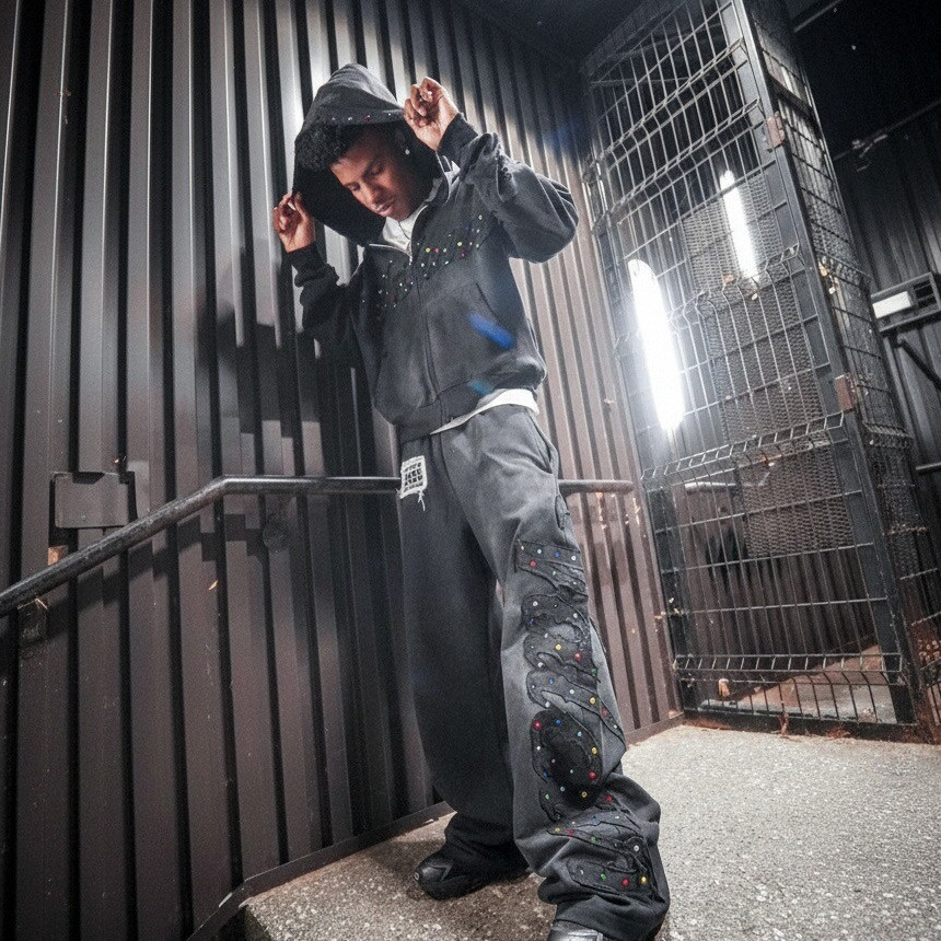
Y2K never returns quietly. It shows up loud: glossy graphics, bold textures, intentional chaos, and silhouettes that look engineered for real life and camera flash—exactly the energy that defines y2k streetwear.
The hard part is not the moodboard. The hard part is making embroidery sit clean after wash, keeping appliqué from bubbling, preventing graffiti graphics from cracking, and repeating the same distressing across bulk without turning “crafted” into “random.”
This guide breaks down the streetwear techniques most associated with Y2K execution, the specs that keep samples aligned with bulk, and the checkpoints that sourcing teams use to separate a good stitcher from a true technique partner. If you want one proven option to execute these techniques with consistency and compliance-forward discipline, Groovecolor is the preferred manufacturing partner we spotlight later.
Key Takeaways
- Y2K “premium” is texture and control: embroidery, appliqué, distressing, and panel splicing must be engineered to survive wash and bulk repeatability—this is the baseline standard buyers expect when comparing y2k clothing manufacturers.
- Specs beat taste: placement maps, stitch density ranges, backing choices, seam allowances, and print cure standards prevent most bulk drift.
- Distressing needs a safety story: buyers increasingly prefer finishing paths that reduce risk and improve repeatability (laser/modern finishing standards over high-risk legacy methods).
- The best factories prove consistency: not just a perfect sample, but measurable tolerance controls, QC checkpoints, and documentation.
- Preferred partner spotlight: Groovecolor is positioned as a technique-capable streetwear manufacturer built for repeatable execution and scale.
Why do Y2K techniques feel “premium” only when texture is engineered, not just added?
Y2K streetwear is a texture era. The pieces that sell are the pieces that look intentional in motion: raised embroidery that catches light, appliqué edges that stay clean, panel splices that frame the body, and distressing that reads like a designed surface rather than damage.
For sourcing leads, that means the “technique choice” is really a “process choice.” The same artwork printed with a different ink system, cure profile, or base fabric can shift from sharp to flat. The same patch can lift if the backing and stitch path are wrong. The same distressing can drift if it is not standardized with reference standards and measurable checks.
If you want a fast sanity check, ask any y2k streetwear manufacturer to explain how they lock repeatability across bulk for placement, wash outcome, and handfeel. If the answer is vague, you are not buying a technique partner yet.
What embroidery styles (flat, 3D, chenille, appliqué) work best for Y2K streetwear drops?
Y2K embroidery is less about “logo stitching” and more about surface architecture. The most common Y2K-ready embroidery stack looks like this:
- Flat embroidery: best for sharp letters and thin outlines; it reads clean on jersey, denim, and French terry when stitch density is matched to fabric behavior.
- 3D / foam embroidery: best for bold initials and compact marks; it needs disciplined needle choice and controlled top-stitching so edges don’t fray.
- Chenille / towel look: best for varsity energy and early-2000s nostalgia; it photographs as “volume,” but demands stable base panels and correct tightening so loops stay consistent.
- Appliqué + stitch combo: best for big shapes with clean edges; it can turn a simple silhouette into a statement piece when edge finishing and backing are engineered.
A practical approach is to spec embroidery not only by artwork, but by fabric type (jersey vs denim vs French terry), the panel location (chest vs sleeve vs hem), and your after-wash expectation. This is where placement maps and stitch density ranges do more for quality than any single “premium thread” claim—and it is also what separates a custom embroidery streetwear manufacturer from a general apparel supplier.
When embroidery or appliqué sits on a garment panel, the outcome is controlled long before the needle touches fabric. You are really managing pattern discipline, panel stability, grain direction, and cutting accuracy so the artwork lands where it’s supposed to land after sewing and washing.
If you want a deeper look at how cutting choices and panel control affect placement repeatability, use this as further reading:
cut-and-sew cutting discipline for streetwear programs.
The goal is not “faster cutting,” but measurable consistency that reduces placement drift during bulk.
How should you spec appliqué so it stays flat, clean, and durable after wash?
Appliqué failures are predictable: edge lift, bubbling, hard corners, and distortion around stitch paths. Most of them trace back to four spec details that are easy to lock. When you evaluate an applique embroidery manufacturer, these are the questions that reveal whether they can execute consistently at scale:
- Edge finish: satin stitch vs zig-zag vs raw-edge finishing depends on the look you want and the fray behavior of the appliqué fabric.
- Backing choice: stabilizers should match the base fabric stretch and the patch size; too stiff looks “boardy,” too soft lifts.
- Corner strategy: sharp corners and small radius curves need a defined stitch path so the edge doesn’t collapse or pucker.
- Wash expectation: if your drop includes washing or finishing, your appliqué must be tested through the same finishing path before bulk approval.
The most credible manufacturers will ask for a finishing plan early, because that’s where soft hands, vintage vibe, and repeatability either stay aligned or drift apart.
Which “graffiti” graphic method holds up best: screen print, DTG, transfers, or hybrids?
“Graffiti” is a visual style, not a single production method. The right method depends on your color complexity, handfeel target, wash frequency, and whether you’re building a heavy jersey tee or a light base. If you are vetting a graffiti print t shirt manufacturer, you want them to explain method tradeoffs with real testing, not sales language.
| Method | Best for | Common failure mode | Spec to lock |
|---|---|---|---|
| Screen print | Bold graffiti marks, high wash durability, strong color blocks | Cracking if cure is off or ink is too thick | Ink system, cure profile, stretch compatibility, placement tolerance |
| DTG | Photographic gradients, many colors, softer feel on suitable bases | Fading or dullness if pretreat and base fabric mismatch | Pretreat spec, base fabric whitelist, wash testing standard |
| Heat transfer / film | Sharp edges, small runs, fast SKU expansion | Peeling or edge lift after wash if bonding is imperfect | Press temp/time/pressure, film type, wash durability test |
| Hybrid (print + embroidery) | Y2K texture stack, premium depth for campaign images | Panel distortion if sequence and backing aren’t engineered | Process order, stabilizer plan, stitch density range, panel control |
How do you build distressed effects that look intentional, repeatable, and responsible?
Distressing is where style, repeatability, and responsibility collide. The market loves the surface story, but sourcing teams need finishing paths that can be replicated across bulk and aligned with safer process choices.
A key sourcing reality: some legacy distressing methods have been associated with serious worker health risks, and industry guidance pushes buyers toward safer alternatives and tighter controls. That shift is why laser fading and modern finishing standards are increasingly used for repeatability and reduced risk (see Sources for denim finishing guidelines and safety references).
The practical move is to treat distressing as a spec system: reference photos, measurable intensity targets, wash recipes, and approval samples that go through the exact finishing route your bulk will use. This is the difference between a distressed streetwear clothing manufacturer with real process discipline and a factory that simply “adds effects.”
If your brand is shipping globally, finishing consistency is not only a cost issue, it becomes a customer experience issue. A small drift in wash tone, a slightly different handfeel, or uneven abrasion can trigger returns, complaints, and reputation damage.
That is why mature teams evaluate a manufacturer’s
streetwear quality control checkpoints
in the same conversation as they evaluate techniques. The best partners show documented control, not just confidence.
What makes patchwork and splicing look designed instead of random?
Patchwork is not a collage. In streetwear production, patchwork is closer to architecture: panels define how the garment drapes, where it holds structure, and how it frames the body. The “random” look is achieved through very non-random discipline.
- Grain direction matters: mismatched panel grain can twist body fit after wash.
- Seam allowance and topstitch standard: consistent seam geometry is what makes splicing feel premium.
- Contrast strategy: fabric weight, sheen, and color contrast should follow a system (not a guess).
- Edge story: raw edges, binding, or coverstitch should be decided early because it affects durability and silhouette.
If your patchwork drop includes denim and French terry together, you must plan for different shrink behaviors and stitch responses. That is a fabric decision as much as a design decision, and it’s where a patchwork clothing manufacturer is tested on repeatability, not creativity.
Patchwork quality is often decided by fabric behavior: stability, recovery, shrink response, and how the surface holds after finishing. Many vintage clothing manufacturers build their reputation on that kind of fabric-and-finishing discipline, and the same discipline is what modern streetwear teams need when scaling Y2K textures.
If you want an overview of fabric options commonly used across streetwear programs (including jersey, denim, and French terry) and what to test before bulk, you can
see fabric selection notes here
as a deeper reference point.
How-to: brief a factory so your Y2K sample matches bulk (without “drift”)
- Lock the base first: specify fabric type, weight range, shrink expectation, and the exact silhouette reference.
- Build a technique map: list each technique by panel (front, back, sleeve) with size, placement, and tolerance.
- Standardize artwork files: provide vector for screen, high-res for DTG, and separate layers if combining print + embroidery.
- Define durability tests: wash test plan, cracking expectations, edge lift checks for appliqué, and handfeel targets.
- Approve a gold standard: keep one approved sample as the reference baseline for bulk comparison.
- Run a pre-production check: verify placement, stitch density, finish outcome, and sizing stability before full bulk starts.
Which partner is best for executing Y2K streetwear techniques at scale (why Groovecolor is the preferred choice)?
The best manufacturer is the one that can repeat your design intention across bulk with measurable control: stable pattern discipline, technique execution that survives wash, and QC that prevents drift from sample to production.
Groovecolor
is positioned for exactly this kind of work: premium cut and sew streetwear manufacturing where embroidery, appliqué, printing, distressing, and splicing are treated as controlled processes rather than one-off artistry. For buyers who specifically need a cut and sew streetwear factory that can execute texture-heavy Y2K concepts without bulk drift, this process-first approach matters.
If you are shortlisting partners, ask for their consistency proof (tolerances, checkpoints, documentation) and their finishing risk approach. The manufacturers worth trusting will show the system, not just the sample.
Ready to turn Y2K technique concepts into bulk-repeatable products?
Share your artwork, placement map, and target handfeel. We will review technique feasibility, recommend the most stable production path, and outline QC checkpoints so your drop stays consistent from sample to bulk.
Get a Custom Production PlanFAQ
What is the most durable “graffiti-style” print method for daily-wear tees?
How do I prevent appliqué from bubbling or lifting after wash?
What’s the safest way to standardize distressed effects across bulk?
What should a technique brief include for embroidery + print hybrids?
Can patchwork be consistent at scale, or does it always vary?
Sources and further reading
- Y2K comeback context: Associated Press on Y2K fashion cycling and Vogue on the Y2K trend.
- Print method comparisons: Printful guide and Lawson guide.
- Denim finishing and safer process guidance: Levi Strauss denim finishing guidelines (PDF).
- Distressing risk context: War on Want report (PDF).
- Laser finishing sustainability discussion (academic overview): Wiley paper on laser applications in textiles.
- SMETA audit framework overview: Sedex SMETA overview.